For the first time in nearly a year, I have finished a new tessellation. I make them so slowly that I don’t have anything to post very often. As a result, this is only my second post in 2017 and it’s already September. Oh well. Happy September to all!
Notwithstanding all that, this piece is an experiment with offset square twists, like in this piece I made a few years ago. Actually, that was four years ago already which is crazy. I’ve been running this site for a long time.
Anyway, I sketched out an idea using offset squares twists sometime last summer. Nothing happened with that for a while, obviously, but I finally got around to implementing to it. The result is composition number twenty six. All the images are below: browse at your own risk.
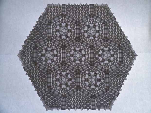
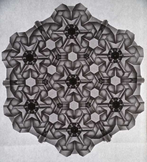
Front backlit:

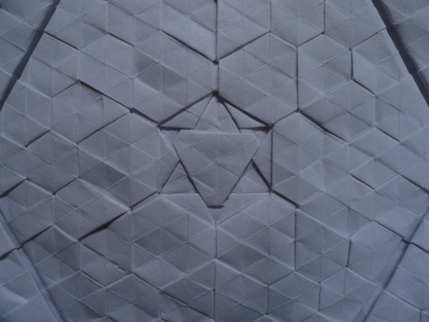
Close up:
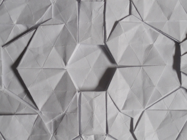
This part of the piece is the starting point. The octagonal ring around the nine offset square twists was the original idea I sketched out last summer. You can see how the offset square twists are different from normal square twists. They don’t directly line up vertically or horizontally. The result is an interesting cock-eyed effect which you can see below.

Close up of the offset square twists:
Two pleats extend out from each side of an offset square twist, as opposed to normal twists which usually only have one. This is what creates the thick bands between the squares.

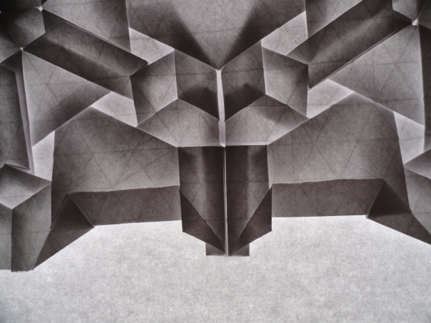
Close up of the intersection of the octagonal rings:
This twist construction is situated comfortably between the short edges of the octagonal rings. Or maybe not so comfortably, because most of the pleats from the rings are directed into it. Since the offset square twists produce pleats that don’t line up very well, this was a bit of a nightmare to work with. This was by far the most challenging part of the piece to design. It took many attempts before I was able to make it work. The final result is this rather strange construction, involving a rotated square within another rotated square, as seen below

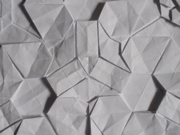
Closeup of the intersection between adjacent ring-sides:
Each octagonal ring has four sides that each directly line up with a side from another ring. This picture is a closeup of the intersection created from those sides.

Edge close ups:
Since the whole design is skewed by the offset square twists, the edge of the piece isn’t symmetrical. This made it a little more challenging to design an interesting border. I like the result, though. It’s different than my other designs, but it looks interesting. In the picture below, you can see the edge’s asymmetry. The right side extends down further than the left side because of the skew.


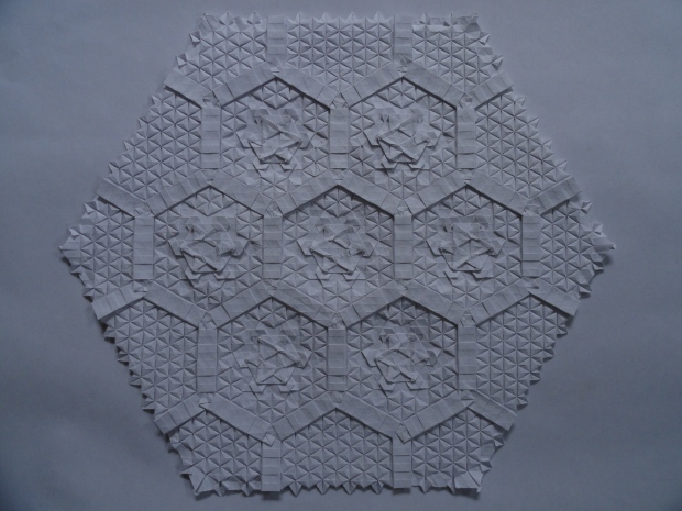
Reverse backlit:

Close up:
This is the reverse side of an octagonal ring. I like the flat, cobble stone appearance. The offset square twists don’t have open backs so it makes this part of the reverse entirely flat.


Close up of ring intersection reverse:
This is the reverse of one of the twist constructions between the octagonal rings.

Close up of the reverse of the intersection of two adjacent ring sides:

Edge close ups:
Again, you can see the asymmetry in the edge. The left side is now lower, as this is the reverse side of the piece.


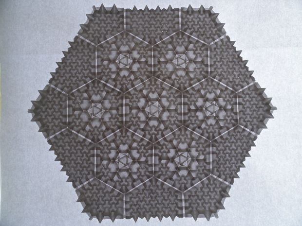
Non-backlit front:

Close up of a ring:
The rings have quite a few layers so they pop out more than the offset twists. I like how it gives the twists an embedded look.


Close up of twist between rings:
These also have quite a few layers, so they are the highest points in the piece.

Close up of the intersection between adjacent ring sides:

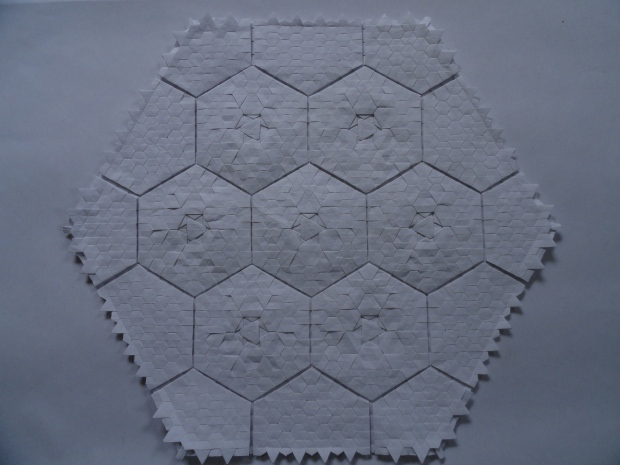
Reverse non-backlit:

Close up of octagonal ring reverse:

Close up of ring intersection reverse:

Close up of the reverse of the intersection of adjacent octagonal rings:

All told, I think I spent more time working on this piece than anything else I’ve made before. I had the idea in July or August of last summer, when I sketched out a very rough draft. From there, it has taken me more than a year to design the piece and fold it. As mentioned several times before, offset square twists produce pleats that don’t line up very well. Typically, twists produce pleats that line up nicely at a single point. The pleats that came off of these twists lined up around a central point, instead of one common point of intersection. This is why those square twist constructions between the rings were so hard to fold and design. There were pleats going in every direction, produced by the offset square twists. I went through a ton of different prototypes before I found something that worked and didn’t look bad. The process took even longer because I would get tired of working on it quickly, when I couldn’t find a solution. After months of kind of working on the design, I finally got something that I was satisfied with sometime around June of this year. Since my summer was completely booked, I wasn’t actually able to implement my design until around the second week of August. After that, it took me a while to photograph the piece and write this post. I’m very glad I finished it, though. I wasn’t sure if I ever actually would…
The piece was folded from a square piece of paper, about 35 inches in width. This is one of the few larger designs I’ve made that use a square grid instead of a triangle grid (the other being this one). Square grids just don’t appeal to me as much as triangle grids, but I really like how this piece turned out. In the future, I will definitely explore them more.
Last time I designed a piece with offset square twists (and by “with”, I mean it was literally only offset square twists), I called it “Windfarm“. The offset square twists give me a sense of movement. Since they’re offset, several of them together create a rippling, moving kind of effect. They also remind me of turbines or propellers; something that catches or moves the wind. For this piece, I wanted to build on that idea a little bit. I created something that is, to me, reminiscent of an airborne vehicle. A Wind Lord’s Chariot, if you will. It’s a fantastical idea, to be sure, but I like that kind of stuff. Fantasy gets my mental gears spinning. That’s basically the story behind the name. Sue me.
That’s also basically all I have to say say about this piece. I’m glad it’s finally done. Like I always say, I have several ideas to work on in the near future. We will see if they come to fruition this year. Additionally, I’ve been thinking about the direction I want to take this site in the future. Be on the look out for information about changes coming sometime- possibly -soon. I’m not planning on changing content, but I want to revitalize the presentation a bit.
Anyway, if you made it this far, thanks for reading through that wall of text. Subscribe to keep up with future compositions and news in the future. Also give my Facebook page a like for content that’s not different at all from the stuff here (except sometimes work-in-progress pictures)!
Thanks for reading!


